In interior design, the term "scale" refers to the relative size and proportion of objects, furniture, and elements within a space. It is concerned with how these elements relate to one another and to the overall dimensions of the room.
"Proportion" is the dimensional relationship of one part to another or to the whole. It involves the ratio of various elements within a space. Proportion is accounted for in the classical orders of architecture, which focus on the proportioning of parts in relation to the whole.
Scale is crucial in creating a visually harmonious and balanced interior. It involves finding the right proportions and ensuring that the size of objects and furniture is appropriate for the size of the room.
A well-executed use of scale can make a space feel cohesive and visually appealing, while a poor understanding of scale can result in a room feeling cramped or disproportionate.
Whether referring to scale or proportion, just remember that it's how design elements relate to each other in a space.
SHOP THE COLLECTION
Table of Contents
- Scale in Interior Design
- Proportion in Interior Design
- Scale and Proportion Design Tips:
- Design Tip #1: Colour Palette
- Design Tip #2: Furniture Choices
- Design Tip #3: Ceiling Height and Vertical Scale
- Design Tip #4: Patterns and Repetition
- Design Tip #5: Layered Lighting
- Design Tip #6: Decorative Vignettes and Accessories
- Design Tip #7: Focal Points
- Design Tip #8: Balance
- Design Tip #9: Human Scale
- Design Tip #10: Open Spaces
Scale in Interior Design
As mentioned above, scale refers to how the size of one object in a space relates to the size of the other objects in the space, as well as the size of the space itself.
Scale is sensed through our experience, learning the relative size of humans, trees, animals, and everything else in relation to each other.
Applied to architecture, “intimate scale,” “grand scale,” and “human scale” are based on how we visually understand a building relative to ourselves, measuring the doors, windows, and ceilings, against our own size and relative to each other.
For example, furniture is designed to human scale, whereas nooks, alcoves, or recessed bay window seats, measure to the intimate scale.
Proportion in Interior Design
Scale and Proportion Design Tips:
Design Tip #1: Colour Palette
Follow the 60-30-10 rule for primary, secondary, and accent colours to create a balanced visual composition.
Photo Source: Michael Del Piero
Design Tip #2: Furniture Choices
Mix furniture pieces of different proportions to create a harmonious flow within the space.
Photo Source: Michael Del Piero
Design Tip #3: Ceiling Height and Vertical Scale
Choose art, mirrors, and other vertical elements that suit the height of your ceiling.
For example, if you have tall-reaching ceilings, opt for larger-scale art pieces and mirrors, tall-reaching bookshelves, and wall mouldings.
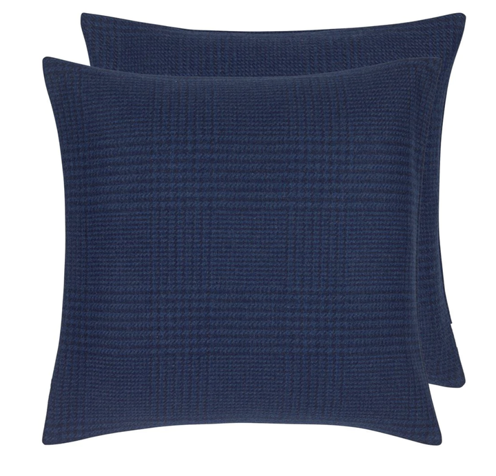
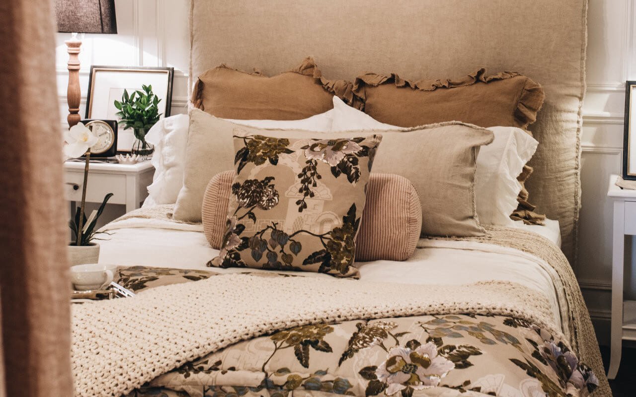
Design Tip #4: Patterns and Repetition
Incorporate patterns of different scales to add visual interest and maintain harmony.
Ralph Lauren | Dudley Glen Plaid Ink Cushion & Insert 55 x 55cm

$498.00
A refined and sophisticated plaid cushion, inspired by the timeless tailoring of Ralph Lauren. This contemporary wool houndstooth design brings a smart, masculine touch to any space. Crafted in a rich inky blue, this large square cushion adds both style… read more
Photo Source: Suzie Anderson Home
Design Tip #5: Layered Lighting
Use layered lighting to scale down larger spaces and create intimate areas within an open-plan layout.
If you want to learn more about the art of lighting, and our ideas for creating a layered, and comprehensive light scheme, you can watch our in-depth video below.
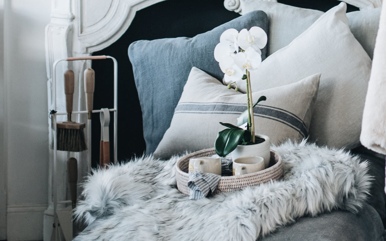
Design Tip #6: Decorative Vignettes and Accessories
Pay attention to the proportions of decorative items, ensuring they are in scale with the furniture or surfaces they will sit on.
For example, large-scale rooms may call for oversize standalone pieces, such as eye-catching sculptures, ceramic vases, woven baskets, coral, and more. This ensures they won’t get lost amongst the furniture and artwork.
The same rules of proportion apply to large and small spaces; keeping decor no taller or wider than one-third the length or the height of the piece it will sit on.
Utilising a decorative tray on a coffee table or console can produce a similar effect by allowing smaller items to be corralled in a curated manner and preventing the display from looking busy or cluttered.
Photo Source: Suzie Anderson Home
Design Tip #7: Focal Points
Scale can be used to draw attention to focal points in a room. By introducing an element of a larger scale or contrasting scale, such as an oversized artwork or a statement piece of furniture, you can create visual interest and enhance specific areas.
Photo Source: Suzie Anderson Home
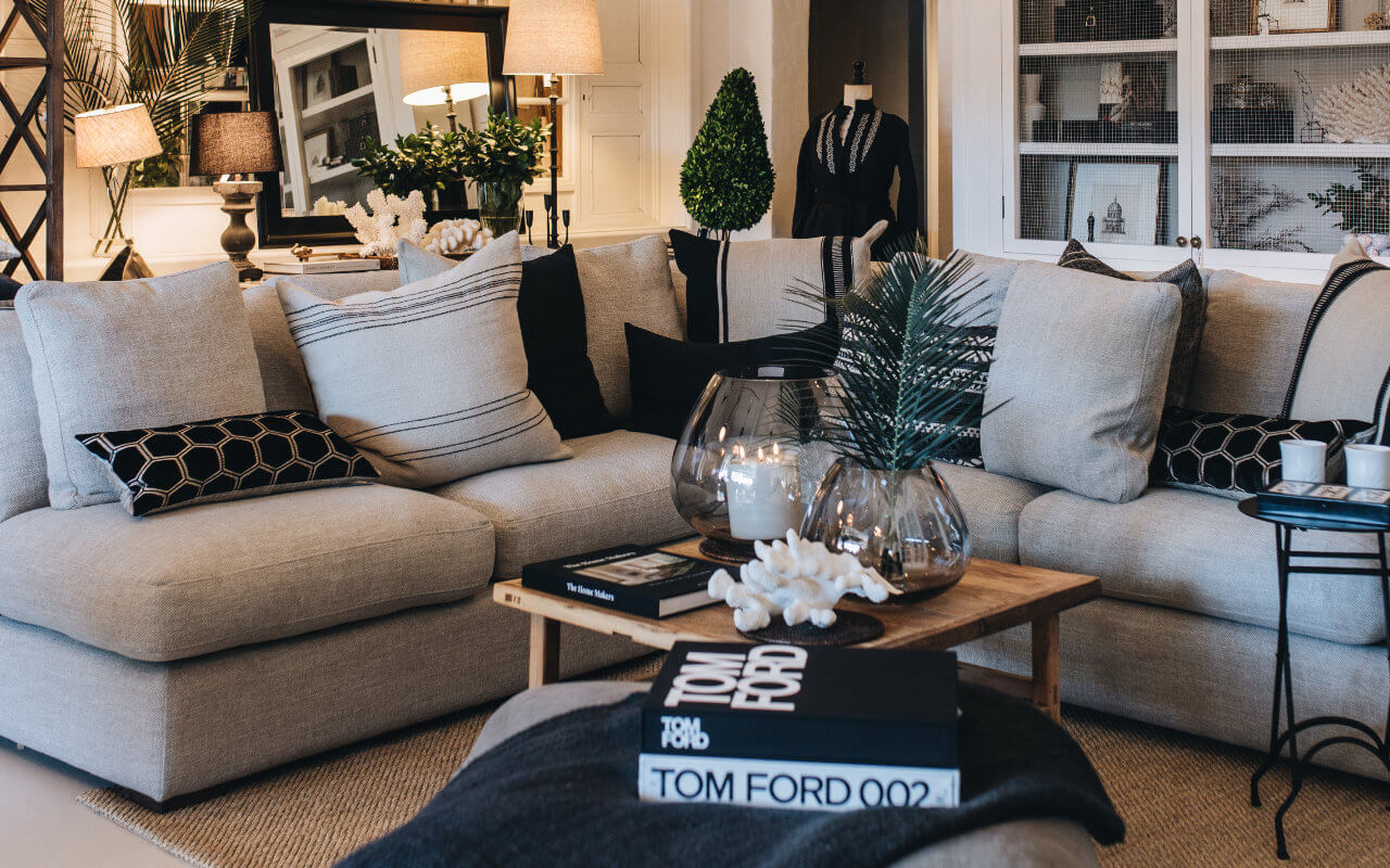
Design Tip #8: Balance
Achieving balance involves distributing visual weight evenly throughout a space. Large or visually heavy objects should be balanced by smaller or lighter elements to avoid a sense of imbalance.
Every element you place in a room has a weight. This visual weight can come from the line, shape, colour, and texture of the different objects, as well as the scale and proportion to achieve a visually balanced result.
It is important not to crowd visually heavy or light elements in one area of your composition, instead, distribute furniture and decorative objects as evenly as possible.
Photo Source: Suzie Anderson Home
Design Tip #9: Human Scale
Considering the human scale is crucial for creating comfortable and functional interiors. Furniture and elements should be sized appropriately to accommodate human dimensions and provide a comfortable and ergonomic experience.
Design Tip #10: Open Spaces
Scale also applies to the relationship between objects and the overall size of the room. In open spaces, it's important to choose furniture and elements that fill the space appropriately without overwhelming it.
Photo Source: Michael Del Piero


